This graph is mainly showing the differences in the gender age distribution for the ‘worst’ countries. I think I included the bottom 10, which you can find from the first graph.
Why do you not show the countries for the second chart?
Leave a Reply
5 visitors online now 3 guests, 2 bots, 0 members Max visitors today: 16 at 02:06 am AEST This month: 159 at 06-13-2026 08:27 am AEST This year: 159 at 06-13-2026 08:27 am AEST All time: 882 at 06-11-2021 02:46 am AEST
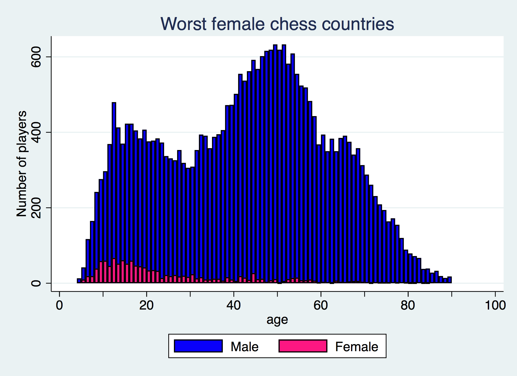
This graph is mainly showing the differences in the gender age distribution for the ‘worst’ countries. I think I included the bottom 10, which you can find from the first graph.
Why do you not show the countries for the second chart?